
TILTD. Magazine
Editorial and Page Design
TILTD. Life on the Edge is a hobby and lifestyle genre magazine with a purpose to demonstrate a unique identity that includes skating, adventure and lifestyle.
During my junior year in college I had the opportunity to design a really amazing magazine that featured 5 articles. A scholastic editors’ article, interview article, a how-to article, infographic article, and travel article. Below is a small sample of what I worked on, including the bold and vibrant brand logo for the magazine.
Areas of Specialty: Brand Identity, Editorial Design, Typography, Illustration, Photo Selection

The Logo Design
The magazine’s logo ties together a blunt, bold, and edgy identity. The slant in the logo is noticeably on purpose to depict the idea of being tilted, as the name of the magazine. The square cutouts in the logo plays along to the magazine cover itself, where the squares are not all in a formal position or pattern but instead some are wonky and misplaced. This idea plays off throughout all the articles.

Magazine Cover

Galvan Talks Interview Article opener, page design
GALVAN TALKS: AN INTERVIEW WITH TODD GALVAN
This 8-page feature story is an interview article with an in-depth profile on Todd Galvan, a valley grown skateboarder that has been skating through his struggles growing up. I wanted to present a layout that was easy to read and use the negative space in a beautiful way. The stunning portrait of the skater and the home-town skatepark spread adds character to the story, while the article is mostly grid and blunt typography throughout the design.

Galvan Talks page design

Galvan Talks page design

Galvan Talks page design, skater’s image spread

Life on a Buzz How To Article opener, page design
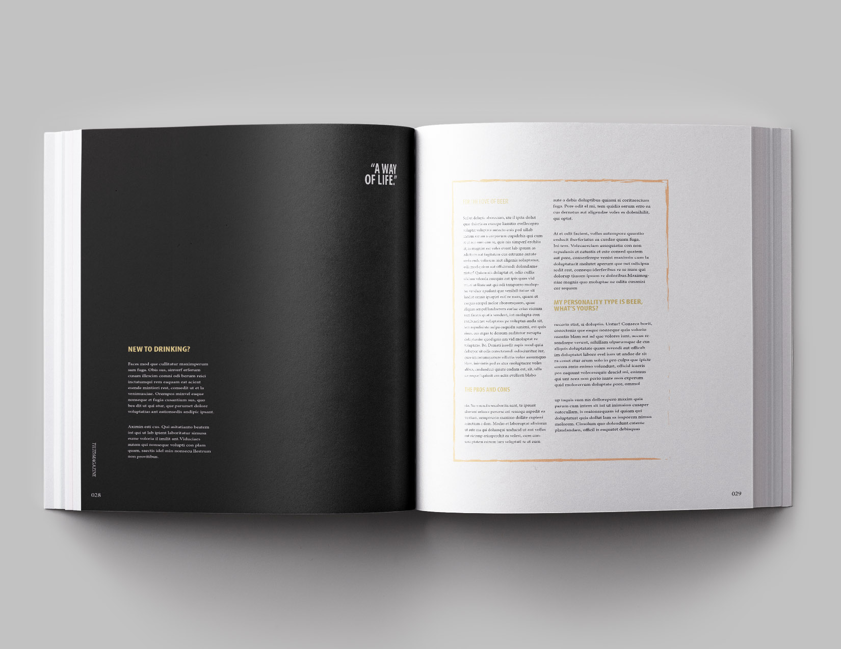
LIFE ON A BUZZ: HOW TO DRINK BEER LIKE A PRO
This 6-page feature was about drinking beer like a pro. The Illustration and quote about beer were assets to article in order to bring the reader in, along with the orange opener page. I used styling, typography and the use of negative space to produce a template that fit the magazine’s identity.

Life on a Buzz page design
Life on a Buzz page design


